


 In this page

Your customers are trying to tell you something valuable through every interaction, click, and the journey they take with your business. Are you listening?
Unlike traditional analytics that focus on what happened, a customer experience dashboard reveals why it happened and how to improve it at a time when companies make 60% more money because they prioritize their customers.
They empower teams to act on real-time insights and deliver more personalized, efficient, and empathetic service.
In this article, we discuss customer experience dashboards and how you can use them to transform customer data into insights for growth.
What is a customer experience dashboard?
A customer experience dashboard is a visual interface that brings together data across all contact points, reflecting how customers interact with your brand.
It pulls information from various customer touchpoints such as customer support tickets, survey responses, social media, and transaction records, creating one comprehensive view of your customer health score.
Why are customer experience dashboards important?
Customer experience dashboards play a critical role in aligning teams around what matters most, that is the customer’s perception of your product.
Here are the key reasons why customer experience dashboards matter:
- Provides a centralized data view: CX dashboards combine data from multiple sources into a single platform. This eliminates data silos and enables a holistic understanding of the customer journey.
- Access to real-time insights: The dashboards provide up-to-date information, enabling businesses to respond swiftly to customer issues as they arise.
- Improves strategic decision-making: Customer experience dashboards turn raw data into actionable insights by highlighting trends and performance gaps in real-time, allowing teams to take targeted action before an issue affects the business.
- Allows tracking of business performance: CX dashboards show various trends, such as improvements in customer retention or first resolution rates. This helps businesses measure the impact of their efforts over time and adjust strategies for better results.
- Promotes personalized customer interactions: By analyzing customer preferences and behaviour, businesses can enhance service through personalized recommendations and targeted promotions that align with individual customer needs.
Ways to build a successful customer experience dashboard
Designing and implementing an effective customer experience dashboard requires careful planning and adherence to best practices to ensure it is not just visually appealing but also actionable and insightful.
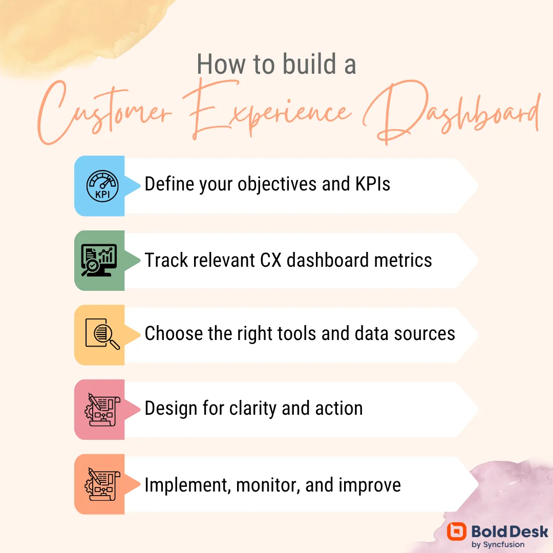
This is how you can build one:
Define your objectives and goals
Before building a customer experience (CX) dashboard, it’s important to know what you want to achieve. What do you want to improve or what part of the customer journey map matters the most?
From this, come up with goals that align best with your current customer service and overall business priorities. It could be in the form of:
- Making customers more satisfied
- Reducing the number of customers who leave
- Helping your team work more efficiently
The dashboard should focus on the most important touchpoints of your customer journey that connect to these goals.
Track relevant customer experience dashboard metrics
When it comes to assessing customer experience, more data isn’t always better; it’s about measuring the right data.
To truly understand and improve how customers experience your brand, you need to focus on metrics that matter. Ask yourself:
- Which CX metrics give you a clear view of customer loyalty and satisfaction?
- How do you measure the ease of your customer support journey?
- What signals might indicate customers are slipping away?
These are some of the key customer experience dashboard metrics you should consider:
- Net promoter score (NPS): Used to measure customer loyalty by asking how likely they are to recommend your product or service on a scale of 0-10.
- Customer satisfaction (CSAT) score: Gauges how satisfied customers are with a specific product or service usually collected after support interactions.
- Customer effort score (CES): Measures how easy it was for a customer to get an issue resolved independently without assistance from support teams.
- Churn rate: This is the percentage of customers who stop using your product or service over a given period. A high churn rate may indicate unmet customer expectations, such as poor customer support or product quality.
- Customer lifetime value (CLV): A customer experience metric that estimates the expected total revenue a customer generates during their relationship with your brand.
- First response time (FRT): This is the time it takes for a support agent to respond to a customer’s first message or ticket.
- Time to resolution (TTR): Used to determine the average time taken to fully resolve a customer issue from the moment it’s reported.
Choose the right tools and data sources
Customer experience data lives in many places. You need the right tools to make it easy to pull data from multiple sources, merge data into a unified view, and display the data through clear, customizable dashboards.
Select tools that can connect seamlessly with your key data systems, such as:
- CRM platforms
- Customer feedback tools
- Help desk ticketing system
Prioritize tools that support both structured data (e.g., customer profiles and sales history) and unstructured data (e.g., open-text feedback and chat transcripts) to capture the customer experience.
For example,
BoldDesk’s reporting and analytics brings together data from support tickets, CSAT surveys, and key metrics into a unified dashboard, helping agents uncover trends and make data-driven decisions to enhance customer experience.
Additionally, built-in tools like the CSAT survey module and NPS calculator help teams accurately measure customer sentiment and loyalty, delivering instant insights without manual effort.
Design the CX dashboard for clarity and action
According to Stanford Web Credibility Research, a good customer experience dashboard should be easy to use and highly useful, helping people take action quickly.
Here’s how to make that happen:
- Use visuals that make sense: Use charts, graphs, and pictures to simplify complex information for better understanding. This is because different people need different details.
- Keep the CX dashboard simple: Don’t overload the customer experience dashboard with too much information. Only show what each person really needs to know. If the dashboard is confusing or messy, people won’t want to use it. But if it’s well-designed, it turns lots of data into clear, helpful insights.
- Make your customer experience dashboard easy to use: The dashboard should be simple to click through and explore. Add features like filters and buttons that help users find what they need.
- It should be accessible: Let users explore the data in different ways, like filtering by location, product, or how far along a customer is in their journey. Everyone should be able to find what they’re looking for without getting stuck.
Optimize and evolve your CX dashboard
After conducting all the steps mentioned above, launch your CX dashboard.
But that alone is not enough. Refine it consistently based on customer feedback and evolving business needs.
Real-time customer feedback loops, automated alerts, and predictive analytics empower teams to identify shifts early, test solutions quickly, and scale successful interventions across the organization.
This process includes continuously monitoring key performance metrics, analyzing the data for insights, acting, and constantly improving where necessary.
How to get insights from your customer experience dashboard
Customer experience (CX) dashboards provide a centralized view of customer interactions, but the real value lies in how you interpret that data.
Here’s how to turn data from your customer experience dashboard into meaningful insights.
Identify patterns across key metrics
To gain meaningful insights from your customer experience dashboard, start by identifying trends and patterns in customer service KPIs such as average response times.
Use visualization tools like line graphs or heatmaps to track these metrics over time while looking for recurring spikes or dips that might indicate seasonal trends, operational issues, or successful strategies.
For example:
- A sharp drop in customer satisfaction scores might indicate a delayed response or a negative customer experience.
- Unexpected drops in first response time could mean your team is overwhelmed or understaffed.
Analyze channel-specific performance
Your dashboard likely aggregates data from multiple customer touchpoints.
Dive into channel-specific metrics to understand how each communication platform performs.
Take, for instance:
- Compare response times and resolution rates across channels to identify which ones are underperforming.
- If chat has a higher first-contact resolution rate than email, investigate what’s driving that success.
For higher chances of success, use filters to isolate data by communication channel and metric scores then benchmark performance against industry standards or internal goals.
This analysis helps you optimize resource allocation and tailor strategies to each communication channel’s strengths.
Combine structured and unstructured data for deeper insights
Structured data, e.g., ticket count, NPS and resolution times, provides a quantitative view that tells you what is happening.
On the other hand, unstructured data like customer comments, complaints and reviews add context and inform you why something is happening.
By integrating structured and unstructured data, organizations gain a more complete and actionable understanding of customer experiences.
While structured metrics highlight trends and performance, unstructured customer feedback reveals the underlying causes and emotions that drive those numbers.
For example:
- A low NPS score may indicate that customers are unhappy due to recurring issues, which are often reflected in repeated complaints found in support ticket logs.
- Internal support notes could reveal recurring questions, suggesting a need for better customer self-service options like FAQs or help articles.
Together, both types of data empower teams to move beyond surface-level analysis, uncover root issues, and make smarter, more customer-centric decisions.
Identify the cause-and-effect relationships between metrics
Use your CX dashboard’s correlation tools or scatter plots to explore relationships between metrics, such as how resolution rates affect customer churn.
For instance:
If faster response times correlate with higher CSAT, prioritize investments in automation or staffing.
However, be cautious of false correlations. Always cross-reference with qualitative data or A/B test results to confirm causality before taking action.
Mapping relationships between metrics helps you focus on high-impact areas that improve customer experience.
Top customer experience dashboard examples
Each customer experience dashboard has it’s specific type of information. Generally, they are built to give teams clear visibility, performance tracking, and customer insight, supporting strategic improvements across customer support operations.
The top customer experience dashboards to use include:
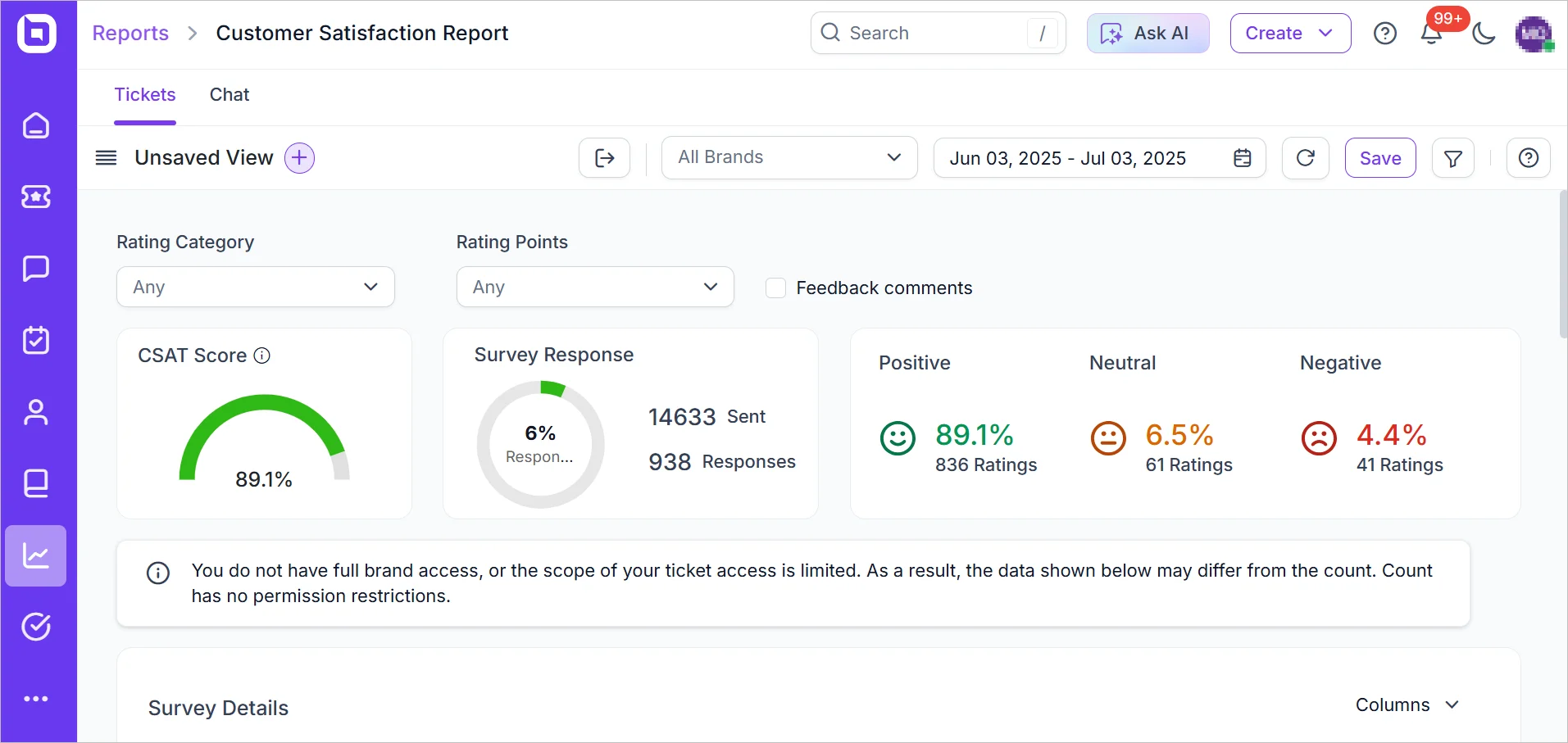
Customer satisfaction report
The customer satisfaction report is a key feature of a CX dashboard, offering a unified view of how customers rate their service experiences. It shows how happy customers are with your service.
How it supports customer experience:
- This CSAT dashboard gives you quick stats on customers’ satisfaction levels.
- It lets you read feedback and helps you turn them into actionable insights within a centralized place.
With tools like sentiment indicators, filters, and in-report actions, it helps teams quickly identify issues, track trends, and take action to improve customer satisfaction and ultimately boost customer experience.
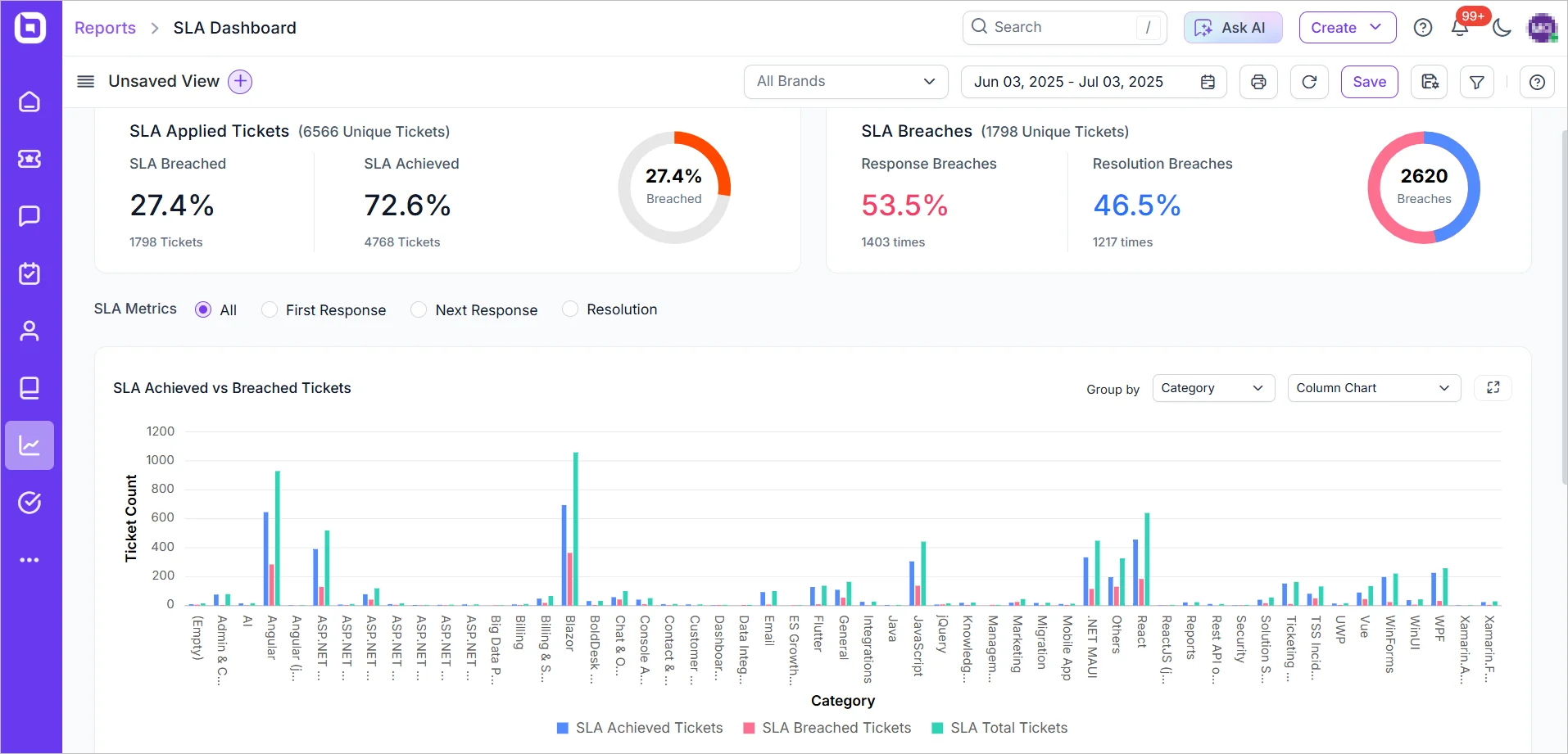
Service level agreement (SLA) dashboard
The SLA dashboard is a visual tool designed to monitor how well your support team meets service expectations that directly impact customer experiences.
How it supports customer experience:
- The SLA dashboard monitors essential metrics like first response time, next response time, and resolution time, all of which shape the customer’s perception of responsiveness.
- Visual comparisons between SLA achievements and breaches help teams quickly identify performance gaps.
- Time-based patterns and detailed stats on delays reveal when and where violations occur, guiding workflow improvements.
With smart filtering options for SLA type, ticket priority, category, and more, teams can drill down into specific service areas to uncover trends and take targeted action.
By aligning SLA performance with customer expectations, this dashboard empowers teams to deliver faster, more reliable support, enhancing the overall customer experience.
Customer journey dashboard
The customer journey dashboard provides a broader, end-to-end view of how customers interact with your business across multiple touchpoints.
How it supports customer experience:
This CX dashboard maps the entire lifecycle of a customer service experience by:
- Visualizing each stage of the customer’s interaction.
- Measuring the time spent at each stage to identify delays.
- Highlighting where customers disengage or abandon the product.
It’s useful for identifying friction points, optimizing workflows, and ensuring a seamless, consistent customer experience.
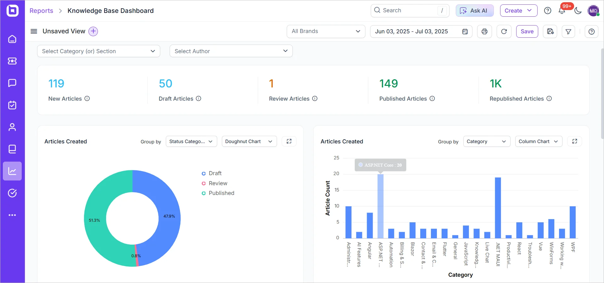
Knowledge base dashboard
With up to 81% of consumers wanting more self-service options, the demand for effective self-help content is growing rapidly.
A knowledge base dashboard helps track how well your self-service is performing, both for internal and external customers.
How it supports customer experience:
- The KB dashboard measures article views, search success rates, customer feedback, and deflection from support channels.
- It highlights top-performing content, flagging articles that receive poor ratings or high ticket deflection failures.
By keeping tabs on the drafted, reviewed and published articles progress, plus showing their effectiveness or relevance, it gives you a clear view of where to improve your customer experience through self-service.
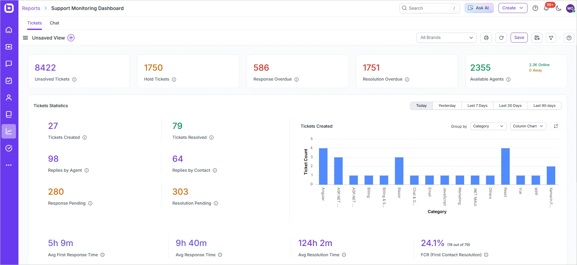
Support monitoring and traffic dashboard
Monitors real-time operational metrics such as incoming tickets, open cases, service level agreement (SLA) status, and agent activity.
How it supports customer experience:
- Displays live data on ticket volume, response queues, and SLA breaches so managers can react instantly to increase in demand or service delays.
- Additionally, it highlights limitations, alerts on overdue tasks, and shows which agents are available, busy, or overwhelmed, all in one view.
This real-time visibility ensures faster response times, minimized service disruptions, and consistently high service quality, leading to better customer experiences.
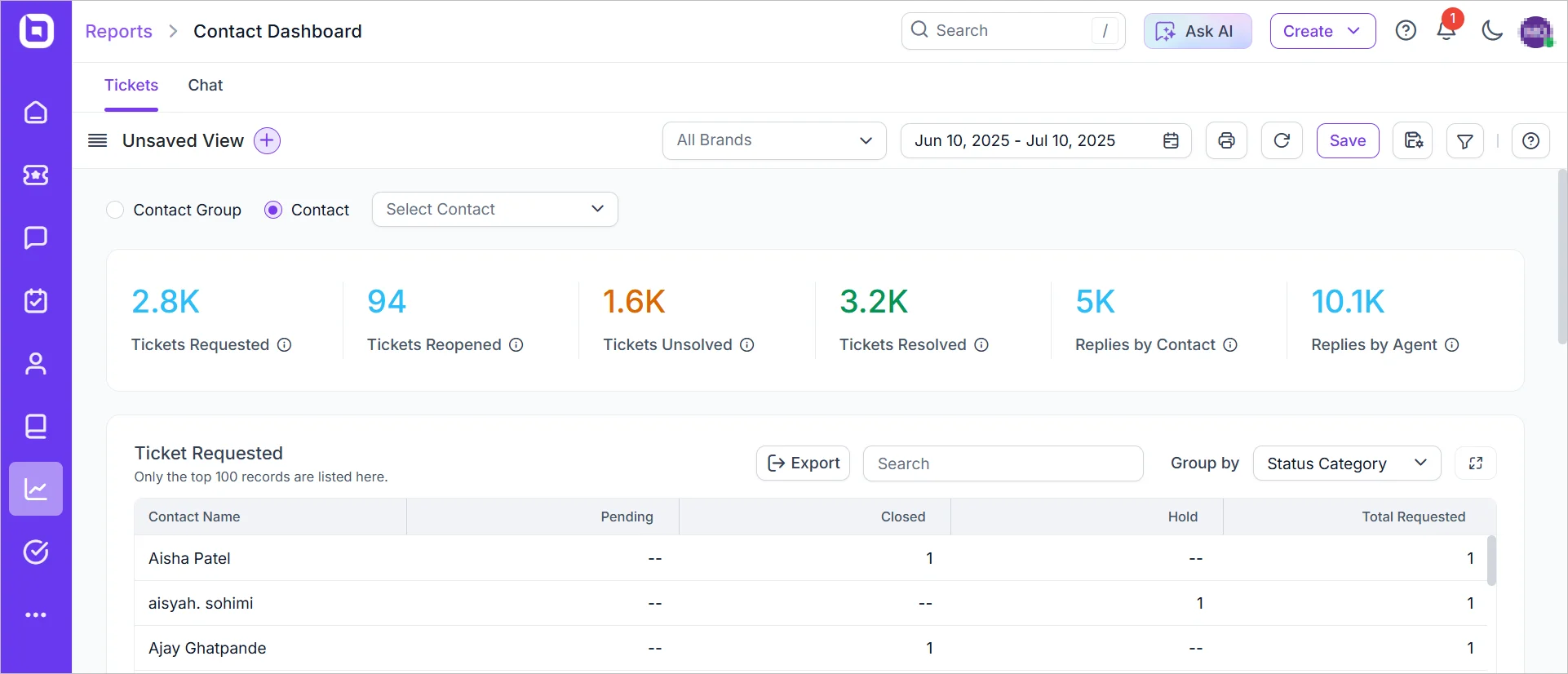
Contact dashboard
A contact performance dashboard is used to evaluate how well each customer contact or conversation performs in terms of timeliness, resolution, and satisfaction.
How it supports customer experience:
- Assesses each conversation based on resolution time, number of replies, CSAT, and escalation frequency.
- This customer experience dashboard visualizes performance at the ticket level, helping teams understand which types of interactions succeed and where processes need refinement.
These insights allow teams to refine workflows, improve agent training, and tailor responses, ensuring that every customer receives timely, effective, and high-quality support.
Transform your services with a powerful customer experience dashboard
Remember, the goal isn’t to build the perfect dashboard from day one, it’s to create a foundation that evolves with your understanding of customer needs and business priorities.
The question isn’t whether you need a CX dashboard; it’s whether you can afford to operate without one in a highly competitive business landscape.
Luckily, BoldDesk’s reporting and analytics feature includes key CX dashboards that bring all your customer data into one place and turn it into insights that drive real impact for your business and your customers.
Have thoughts or questions? Drop them in the comments below, we’d love to hear from you.
Related articles